Your business logo speaks a thousand words. It’s what the public initially sees so it must appropriately and effectively represent your business at its core.
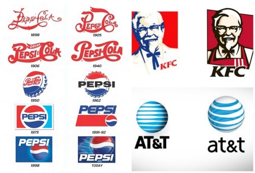
Every now and then, businesses and companies make some changes in their logos. Even the most well-known brands do this.

So how about you? When will you know if it’s time to change your business logo? Here are some signs:
Your logo isn’t adaptive to modern media
If your logo was first designed for your store 15-20 years ago, then there’s a possibility that it won’t work and look well on your website and on social media pages. It may have looked good in the Yellow pages, but not necessarily in modern media.
Here are some questions that you should ask yourself:
- Can the logo’s size be adjusted and still be readable?
- Does the logo look good in black and white?
- Can an icon be derived from it?
- Does it look appealing even as a button in a mobile app?
If the answer to any of these questions is no, then it’s time for you to have a new logo design.
Your logo doesn’t appropriately represent your business at its present state.
If your business has evolved, then it’s most likely that you need to revise your logo. Your logo must reflect what you offer & what your brand has become, as well as where you’re headed in the future.
You did the logo by yourself.
Companies like Apple became successful due in part to the importance that they give on design. If, at first If you created your logo or had a friend dessign it, then it may be time to have a professional step in. You can never underestimate the valuable contribution that a design expert can give.
Your logo isn’t as appealing as compared to your competitors’.
Do some research and take a look at the logos of your competitors. If you find that their logos are more appealing, then it’s an indicator that your logo needs some updating. The impact of good design should never be taken for granted.
Too complex logo
The growing trend in logos today is design simplification. Gradients and drop shadows already look dated, so opt for a simple logo design that uses up to three colors. An indicator that your logo is simple is if it can still be recognized even if it’s used in a transparent form as a background.

